Search


Adam Haddow set out to build a house, but instead, he has captured imaginations. Every day, strangers visit his home in Surry Hills, Sydney, to fondle the gnarled root-like structures of his brass cast gate, stroke the jagged edges of the brickwork and stare in wonder at the animated facade.


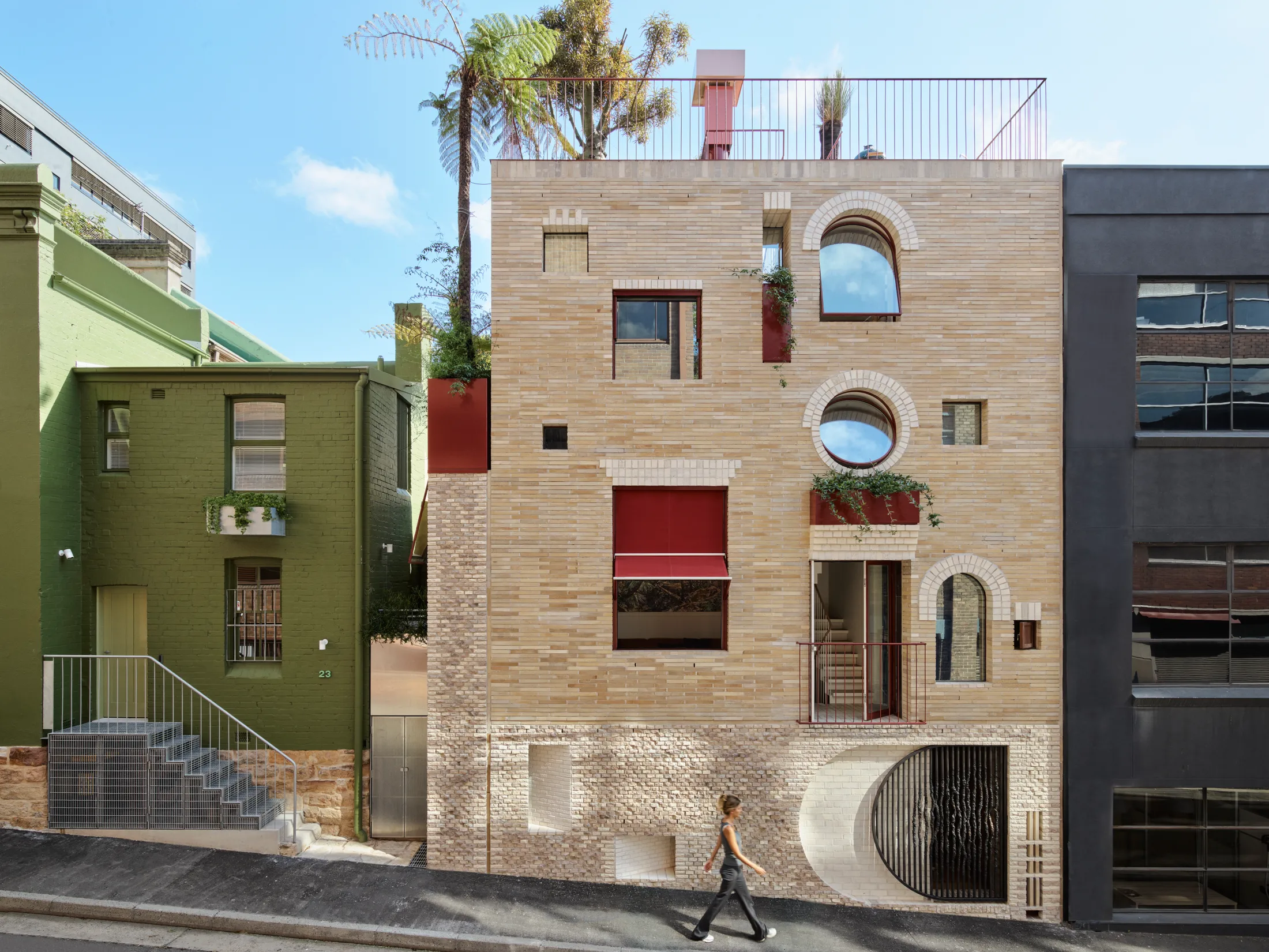
It’s quite the Cinderella story too, as on top of winning public affection, the home has garnered Adam and his practice, SJB, numerous awards despite elements of the original buildings being “The-Silence-of the-Lambs kind of awful”. Adam is an architect who believes in the specificity of place: designing buildings that feel like they could only ever be on that site in that precise location. And while 19 Waterloo Street would not look out of place in a Jacques Tati film, it is most certainly at home right where it is.
How did you find your way to architecture?
My dad was a technical school teacher and he built the house I grew up in. When we first moved into the house there was no floor. The bedroom had a floor, but the living space was a dirt floor because he hadn't quite installed it. It was like growing up on one continual building site.
Every Saturday and Sunday I was building something and helping out (as a five- or six-year-old might) trying things and seeing how he put things together. Then as a 10 year old, and later as an 18 year old – because he was still working on it when I moved for University. I suppose you do learn how things go together when you see it happen in front of you. I was always drawing imaginary plans of houses. So it was just a fixation, really, on three dimensional space, and architecture was the avenue or the lens through which I looked.
We didn't have a dirt floor for too long, by the way. I presume my mum put a foot down and said, ‘now, we're having a floor, thank you very much’
When did the site of your now home come into your possession and how did your vision for it come to be?
We were living in a big apartment, which we loved, but it was just me, Mike and the dog. We were living in 20 percent of the apartment, 80 percent at the time. It was a beautiful apartment, but it was underutilised, and I was getting itchy feet to do something else. One Saturday, we were walking through Surry Hills and we walked past this place that had a ‘for sale’ sign on it (and had done for a while). Mike said, ‘we should buy that’. I said, ‘we’re not buying that! It's too small. It's never going to work’. I went home though, slept on it and then thought, actually,we could maybe make it work.
So I did some drawings and we made an offer on the Monday, and it was sold to us that afternoon. And in a rare story for Sydney we offered less than they were asking and they accepted. I think it had been on the market for around two years and no one had made them an offer. It was a shithole, to be clear.
Talk us through the unique challenges of the site.
The biggest challenge is that it's only a 30 square metre footprint, but once you put the walls in, the internal footprint is only 27 square metres, so it's pretty tight. I probably did 20 different versions of plans to try and work out where the stair might fit best. It's only 3.4 metres deep. So, if you put a stair running along the length of it, you'd only end up with a room 2 metres deep. Putting the stair in the middle and using it as a pinwheel to let the rooms spin off was the solution.
The stair solution enabled us to employ different volumes by using half flights – so you get the served and service spaces. The served spaces are the ‘formal’ spaces – the bits you spend the most time in: bedroom, living room and study. The served spaces are the storeroom, kitchen, robe and ensuite. The service spaces have only 2.1 [metre] ceilings and the served spaces have 3.6 [metre ceilings] and the stair helps you with that, as the half landings get you to get to each space.
I think sometimes you can fall into the trap of thinking that to make a small house feel big, you need to make it open plan. But actually, that's the worst thing you can do, because if you make it open plan, then there's nothing more to it – there is no ‘other’. The idea of the served and service spaces was not only to make sure that there is always ‘other space’ wherever you are standing, but they step up the building – there is a sequence to the way the house rises vertically.
I suppose another of the biggest challenges – because it's so shallow – is that if the facade was too glazed, you could feel like you're living in the street because you could never get far enough back to feel privacy. So, the facade itself was a response to that. It was about camouflaging the interior. Some people think it looks chaotic. But it's quite ordered. The scale of the windows has a direct relationship to the scale of the room and what you look out at – it's about borrowing views. For instance, how do you frame an opening to borrow a view of a tree or the sky or something, so you're not looking directly across at another building?
How on earth did you do this when you didn’t have the existing elevation to work from and gauge what you were borrowing a view from?
I think it's quite instinctual to be honest. It's not necessarily about being completely specific, like: I must have a window here to see that bit of the tree, it's just thinking, well, if I can just work it out to just pivot your view, not necessarily pivot the window, but pivot your view, then you’ll catch something a bit more interesting than what's in front of you.
It stretches back to my interests at university – I did my thesis on film and architecture – exploring the type of space that’s created in film. I was interested in how a cinematographer made you imagine things outside of the frame. So, in lots of cases, a room is not actually a room. It's just two walls and you're imagining what's behind you and you never get to see it. But your mind fills the rest in. Right? So, what we're trying to do with the architecture is draw you outside of the frame and make you imagine that there's something over there, which may not ever exist, but it's just trying to stretch the space, or stretch your perception of the space so it makes it feel bigger than it physically is.
Did you enjoy the experience of being so constrained in your design?
Yeah. I loved that. I mean it's an efficient use of space, right? Whenever I drive between Melbourne to Ararat to see my mum and dad, you see a continual sprawl of houses, engulfing farmland and paddock spaces and community space. And you just think, oh my God, we're destroying the very thing that we hold most dear, which is this idea of outdoor space and nature.
So the intent here is: can we create an opportunity for people to imagine living a smaller footprint, without forcing them to give up on the things that they really want? Sometimes in small housing, there's this thing where the staircase becomes a drawer for your underwear and there has to be a ladder to get up to your bed and all that kind of bullshit, which I hate. I don't want to feel like I'm living in a cubby house. I still want to have a high level of amenity. That’s what my husband's position was: can we make a small house feel grand? Can we have all the things we used to have, like a rooftop garden, and a barbecue, and still live small?
And, actually, we have three barbecues. Because Mike loves cooking. So it's about how to fulfil all of those idiosyncratic requirements of a client, but still keep it tight, and then get rid of the things you don't need.
Let’s talk about those bricks….
They were discarded from quite a famous project in Sydney called Phoenix – a Performing Arts Centre in Chippendale, which is amazing. They were made by a friend, Klynton, who owns a brick company – the oldest continuous family run brick company in Australia called Krause Bricks.
I saw these bricks and there were pallets and pallets of them. I asked, ‘what are you doing with them? Which project are they going into?’ He said, ‘they're not going to project. They came back from a project.’ They were rejected because the colour wasn't quite right or the scale of the brick wasn’t right or was a bit wonky. Because they're all handmade. So there's a level of inaccuracy to them. I was like, ‘Oh my god, what are you going to do with them?’ and he said, ‘I'm going to crush them into road base, because there's nothing else I can do with them,’ then I said, ‘Okay, let's not do that! Let's use them.’
I presume Klynton is responsible for the beautiful brick flooring inside as well?
Yes. We were trying to find a material which was, I suppose, of place and had a beautiful texture to it. The brick just became really relevant. There's a tradition of bricks and tiles in inner Sydney so there was a heritage consistency to that. And also because the site was so tight, the small footprint was also difficult for the builder. So having a brick is nice because it's a small item and easy to handle.
You clearly have an interest in film and architecture and their points of intersection. The Jacques Tati link pops up in reference to the facade of your home quite a bit. Is this an outsider's lens or were his films a genuine source of inspiration for you?
The Tati films were something that I looked at during my university thesis. I think the interesting thing about those films is that they were made during a period when there was a lot of innovation happening in France. As a country, France had been held back because of World War II. So, when the war finished and they were slung shot into a different world, there was this massive shift from pre-World War II to post-World War II – from village life to modern life. The Tati films capture that quite well – they are a clear indication of how quickly things changed in French society.
A lot of modernism became overly serious and it was all very straitlaced and pared back. It was probably minimalism over modesty, whereas the Jacques Tati films were much more about playfulness and joy. And I think that's kind of what I was trying to make sure happened, that there was still joy and delight in the building.
That joy and playfulness certainly comes through and it also reads as simultaneously contemporary and timeless. Was this something you set out to achieve?
I think it's about how do you not be fashionable, because fashion ends up being replaceable. People get sick of it. So, can you do something which has a sense of permanence to it, where people see the joy in it – six months, six years, 60 years after it's built? So that was a desire. The house has captured people's imagination – I never thought there'd be such a reaction to the house. I was just making a house.
But ridiculously and possibly naively, I made the name of the house the address. Just not really thinking about it. But there are so many people who now come to look at the house every day. There will be people outside the house looking, touching the brass gates and the brickwork. So it has done something and hopefully it's got that balance of contemporary and familiar right.
How did the dramatic skylight and plants-in-the-shower situation come to be?
Originally there was going to be a glass wall, with no skylight. It was just going to rain into the garden, because our last house had an amazing shower and an amazing garden off the shower and we loved it. So we thought, let’s do something similar, but on a smaller scale. Then during construction, I'm like, what are we doing? This is stupid. We're putting a glass wall, the plants will be squashed! So we took the glass wall out and put a skylight on. The plants have gone nuts – it's become an amazing terrarium-like space!
And how about THAT painting?
The painting is by Nicholas Harding. We commissioned it before the construction of the house was started as we knew how big the wall would be. We asked Nicholas to imagine what would have been here before white invasion. The house wasn't finished by the time he’d finished the painting, so he put it into the Wynne Prize (because we had nowhere to store it) and it won.
Please introduce us to your dog.
His name is Eric. Eric is a Yorkshire Terrier. There's one window for Eric in the building because he's too small to see out of most of them. It's right next to my side of the bed. He lays on the floor and gazes out the window. I didn't think he would use it, but he actually does.
Do you have any major influences in your work?
I think if you like a brick, you can't go past Louis Kahn. So there's always the Louis Kahn reference. My favourites are Louis Kahn and Álvaro Siza, and Luis Barragán, and Glenn Murcutt. They’re probably the main four that I really love. But it's not so much the aesthetic of the work.
It's more about their strategies of creating space: Glenn's about the connection to place; Luis Barragán’s about the use of colour and the way in which it can influence your mood and sense of scale; and Siza’s about sequence of movement and how you move in and out of a building and the different light qualities. Then Louis Kahn's world to me is about how the brick comes together to be something…the kind of monumentality of things. Even though the house is tiny, it has a kind of castle-esque quality to it.
What kind of life do the three of you lead here? If you only used 20 percent of your old apartment 80 percent of the time, how does that compare to this place?
We use every inch of this house. Mike loves cooking, so we pretty much never eat out. He’s always cooking something amazing, which is why there are three barbecues. And the kitchen's tiny, but it's fine for him. If we have more than four people for dinner, we go out for dinner. But you can have just the two of us and two friends over for dinner, and it's comfortable and beautiful. There's the capacity to have more people in it, you just have to be more organised.
How do you find the experience of living in a compact but tall home?
We love it. Mike is not an architect and I think the biggest compliment is he literally says to me every day, ‘I love this house’. It doesn't feel like we're living on 30 square metres. It feels generous.
What's your favourite detail in your home and why?
I love the brickwork, because I think it has character and detail. I love the gate that Mika
[Utzon-Popov] made for us, that bronze gate is incredibly beautiful and there's something lovely about having a friend make something for you by hand. And then in the ensuite is a circular mirrored ceiling, it's there to hide a surface-mounted sliding track, which we forgot to detail into the concrete. So we came up with quite a nice circular mirror detail that hides the track. I love it because it's playful and useful.
And what's Mike’s favourite detail?
He loves the painting in the living room. He has a chair in the living room, which is not built in. He chose that chair specifically so he could sit in a certain location and see the painting and enjoy the space of that room.
-
As featured in Issue 2 of our magazine!
Purchase a copy of Issue 2 https://www.nts-store.com/collections/magazine
Subscribe to our NTS Sub Club https://www.nevertoosmall.com/magazine


